UI
Using the Preact component library#
@create-figma-plugin/ui is a library of production-grade Preact components that replicate the Figma/FigJam editor’s UI design.
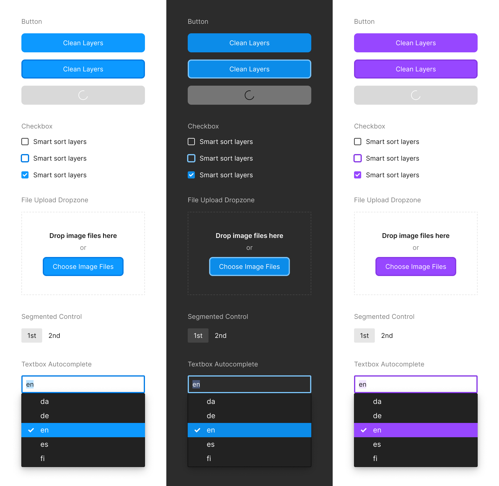
See the full library of components in the Storybook.
The component library ships with three themes:
- Figma (Light)
- Figma (Dark)
- FigJam
If the UI is launched from a Figma plugin/widget, components will automatically render using the Figma theme (either Light or Dark, based on the user’s preferences as set in the Figma app). If the UI is launched from a FigJam plugin/widget, components will automatically render using the FigJam theme.
To install, do:
$ npm install @create-figma-plugin/ui preactThen, include a call to showUI in your plugin/widget’s main entry point.
Consider a toy Figma plugin:
// src/main.ts

import { showUI } from '@create-figma-plugin/utilities'

export default function () {
  const options = { width: 240, height: 120 }
  const data = { greeting: 'Hello, World!' }
  showUI(options, data)
}
showUI takes two arguments, and the second data argument is useful for passing some initializing data to the UI.
Next, create a file for our UI (eg. src/ui.tsx):
// src/ui.tsx

import { render, Container, Text, VerticalSpace } from '@create-figma-plugin/ui'
import { h } from 'preact'

function Plugin (props: { greeting: string }) {
  return (
    <Container space='medium'>
      <VerticalSpace space='medium' />
      <Text>{props.greeting}</Text>
      <VerticalSpace space='medium' />
    </Container>
  )
}

export default render(Plugin)
See that:
rendertakes a single argument,Plugin, which is a Preact functional component.- The
propsreceived by thePlugincomponent is precisely thedataobject that was passed toshowUIfrom the plugin/widget’s main entry point.
Finally, in package.json, point to our UI file on the "ui" key under "figma-plugin":
{
  // ...
  "figma-plugin": {
    // ...
    "name": "Hello World",
    "main": "src/main.ts",
    "ui": "src/ui.tsx"
  }
}
When we rebuild our plugin and run it, we’ll see:

See the Storybook for the full library of Preact components, and the recipe for passing data between the plugin/widget’s main and UI contexts.
Using custom CSS#
Out of the box, the build-figma-plugin CLI supports CSS Modules:
/* src/styles.css */

.container {
  background-color: var(--figma-color-bg-secondary);
}
// src/ui.tsx
import { render } from '@create-figma-plugin/ui'
import { h } from 'preact'
import styles from './styles.css'
function Plugin () {
// ...
return (
<div class={styles.container}>
{/* ... */}
</div>
)
}
export default render(Plugin)By default, all the class names in CSS files imported via an import statement (as in the above example) will be hashed. This is to ensure that each class name is globally unique.
To directly “inline” a CSS file in your UI without hashing its class names, add a ! prefix to the import path:
// src/ui.tsx

import { render } from '@create-figma-plugin/ui'
import { h } from 'preact'
import '!./styles.css'

function Plugin () {
  // ...
  return (
    <div class="container">
      {/* ... */}
    </div>
  )
}

export default render(Plugin)
Refer to the base.css file in @create-figma-plugin/ui for the list of CSS variables that are available for use in your custom CSS.
Using Tailwind CSS#
Install tailwindcss, preact, and concurrently:
$ npm install --save-dev tailwindcss preact concurrentlyThen, create a tailwind.config.js file and src/input.css file:
// tailwind.config.js

/** @type {import('tailwindcss').Config} */
export default {
  content: ['./src/**/*.{ts,tsx}'],
  theme: {
    extend: {},
  },
  plugins: [],
  darkMode: ['class', '.figma-dark']
}
/* src/input.css */
@tailwind base;
@tailwind components;
@tailwind utilities;Update the scripts in package.json to invoke the tailwindcss CLI:
{
  "scripts": {
    "build": "npm run build:css && npm run build:js",
    "build:css": "tailwindcss --input ./src/input.css --output ./src/output.css",
    "build:js": "build-figma-plugin --typecheck --minify",
    "watch": "npm run build:css && concurrently npm:watch:css npm:watch:js",
    "watch:css": "tailwindcss --input ./src/input.css --output ./src/output.css --watch",
    "watch:js": "build-figma-plugin --typecheck --watch"
  }
}
Then, import the generated stylesheet (./src/output.css) in your UI:
// src/ui.tsx

import { render } from '@create-figma-plugin/ui'
import { h } from 'preact'
import '!./output.css'

function Plugin () {
  return (
    <h1 class="text-3xl font-bold underline">
      Hello, World!
    </h1>
  )
}

export default render(Plugin)
Note the use of a ! prefix before the stylesheet import path – this is to “inline” the CSS file without hashing its class names.
For a runnable example, try the preact-tailwindcss plugin template:
$ npx --yes create-figma-plugin --template plugin/preact-tailwindcssUsing React#
When building your plugin/widget, the build-figma-plugin CLI will detect and automatically swap out all react and react-dom imports with preact/compat. This means that it’s possible to seamlessly use React components alongside the Preact components from the @create-figma-plugin/ui library.
(If you still prefer to bundle React rather than Preact, see the recipe to disable the automatic swapping of React imports.)
If you want to use a React component in your UI, add the following configuration to your tsconfig.json:
{
  "compilerOptions": {
    // ...
    "paths": {
      "react": ["./node_modules/preact/compat"],
      "react-dom": ["./node_modules/preact/compat"]
    },
    "skipLibCheck": true
  }
}
This is to ensure that Preact’s types are used in place of React’s, and to suppress TypeScript compilation errors when any React component uses types not provided by preact/compat.
For a runnable example, try the react-editor plugin template:
$ npx --yes create-figma-plugin --template plugin/react-editorUsing a custom UI library#
To use a custom UI library instead of @create-figma-plugin/ui, write your UI implementation as follows:
// src/ui.ts

export default function (rootNode: HTMLElement, data: { greeting: string }) {
  rootNode.innerHTML = `<p>${data.greeting}</p>` //=> <p>Hello, World!</p>
}
The exported function receives two arguments:
rootNode— An empty<div>element within which you can render your UI.data— This corresponds to thedataobject that was passed toshowUIfrom the plugin/widget’s main entry point.